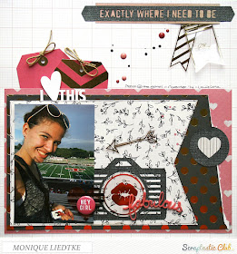
This month I'm working with the Elastic Heart kit and for today's project I used the main kit only:
But, NOT included in this kit are the digital cut files I used on this page: the camera, the circle with the heart and the strip with the text in the top right corner.
To create all of these I used the (image of the) stamps from the August Wednesday Night kit. Want to know how?? Well let me show you!
To create all of these I used the (image of the) stamps from the August Wednesday Night kit. Want to know how?? Well let me show you!
First of all, the stamp set: make sure before you start to save the image of the stamp set in your computer (easiest way is to just right click on the image below and save).
Step 1. Open the stamp set image in your Silhouette:
Step 2. Click on the trace icon in the top right corner, click "select trace area" and select the entire stamp set:
Step 3: remove the click at "High Pass Filter" and change the "Treshold" to about 60:
Step 4: Click the "Trace" button:
Step 5: Drag the black image aside and delete:
Step 6: Voilà: your own cut files!! Drag one of the corners to change the size:
I used the shiny black cardstock (My Mind's Eye: Black Bear) from the Elastic Heart main kit for my cut files:
Really loving the result!! Hope you'll give it a try too. If you have any questions, don't hesitate to ask!
Don't you just love that pink acrylic word or those gold foil pennants from the WeR ephemera package in this kit?!
Thank you so much for stopping by and if you want to check out this kit and it's contents, just go HERE.
Have a fab week!
Hugs,


This is such cool information - you are so smart and so good to share these tips with us - I don't do diecuts like this but I admire those who do!! This layout is so awesome and your daughter looks so super happy!!
ReplyDeleteThis is gorgeous! LOVING the photo, the colors, the tags and the lips!!!!!!!!
ReplyDeleteThis is fabulous! I've just got a Brother scan n cut machine - so this process is simple dimple to do.... Love those tags tucked in on your page... it's a gorgeous LO!!!
ReplyDeleteWat een gaaf idee en het resultaat ziet er super uit! Hele mooie lay-out!
ReplyDeleteWell aren't you the clever one. Will be saving your tutorial for sure and maybe I can past just doing fancy titles on my cameo. :)
ReplyDeleteWOW Totally awesome thanks so much Monique for sharing this and for Vicki for telling me about it..
ReplyDeleteLove it! Great tutorial too! I am sure it will inspire others to give it a try. :)
ReplyDelete